

Welcome back to our column! In the last edition we explored the potential of Multi-Image Blendseeing how to blend the volumes of a warm walnut space with the sculptural, reflective aesthetic of hammered stainless steel. The result was exciting, but as often happens when designing, a render is never really “finished” on the first try: reflections immediately arise on the composition, on the balance of empty and full spaces or on the symmetry of a wall.
Current models continue to make great strides in terms of understanding and visual fidelity. Yet, anyone who uses these tools in everyday study knows well the typical “verbal friction”: spending precious minutes describing with long paragraphs of text Where intervene (for example: “create another niche to the left of the oven, right behind the island mixer, of the same width as the wall unit…”), with the real risk that the AI misunderstands the coordinates and alters the rest of the scene.
Today I want to show you how to solve this bottleneck with an integrated function that is as simple as it is revolutionary: the drawing tool (“Sketch”) directly in the Gemini upload interface.
>> If you want to receive news like this directly on your smartphone, subscribe to our new Telegram channel!
Beyond the textual prompt: the two-color visual code
Instead of relying on lengthy descriptions or switching between external software to create complex masks, we can exploit the true native multimodality of the model by communicating with it as we would with a collaborator at the drawing board: with two strokes of the pen.
The quickest and most effective method is to establish an immediate visual convention:
- Red for source: the architectural detail or volume from which to sample texture and depth.
- Green for target: the exact area where we want to replicate the item.
In this way, the size, the alignment with the door joints and the perspective scale are defined at a glance by our graphic sign, leaving the text only with the task of formalizing the action.
The case study: rebalancing the back wall
Let’s take as a starting point the rendering of the contemporary steel kitchen generated in the last issue. Looking at the rear wall, the bar niche with coffee machine on the right creates a very strong focal point; to give breathing space and balance the architectural composition, we want to insert a second twin niche in the left bay.
Here are the elements of our workflow:
The annotated image (upload with Sketch)
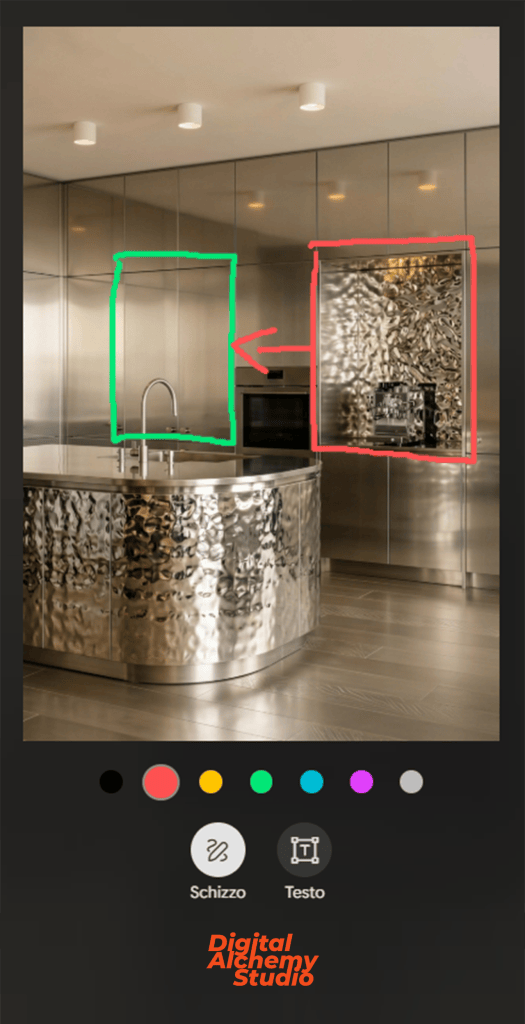
We load the render of the last release into Gemini and, using the integrated Sketch tool – just click on the image once loaded – we directly draw two boxes:
- Red Box: Surrounds the existing hammered steel niche (the source element).
- Green Box: defines the exact column and proportions of the wall in which we wish to place the new niche (the destination element), right behind the sink.
- A simple red arrow visually indicates the transition from right to left.
The control prompt
Together with the visual anchor, it will be enough to add a more streamlined support instruction to obtain the result we need:
“Look at the attached image: in the area delimited by the green box create a mirrored niche, exactly replicating the architectural depth and the hammered metal texture of the niche highlighted in red. Keep the perspective, the gap of the doors and the overall lighting consistent to balance the composition. Remove all graphic signs (green and red) from the final result.”
The result
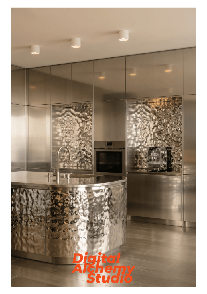
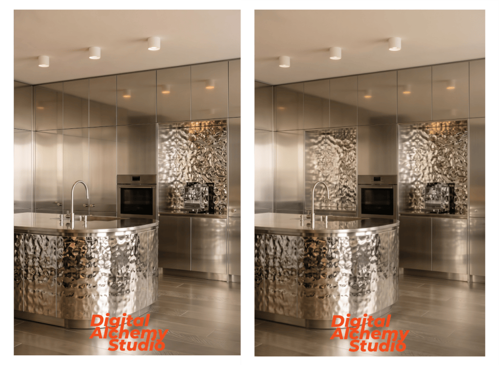
The response of the instrument is surprising for its cleanliness and spatial adherence. Gemini not only interprets the green box as a geometric constraint, but will understand the hierarchy of perspective planes: the new niche is recessed correctly behind to the island tap, preserving intact the silhouette of the mixer in the foreground and the reflections on the horizontal plane.
The colored strokes completely fade from the final image, leaving a perfectly balanced architectural composition, generated in a fraction of the time that a purely descriptive prompt would have taken.
In conclusion
In visual design and architecture, true efficiency lies not in struggling to write increasingly complex prompts, but in how quickly we can transfer a design intention to the machine.
Being able to “doodle” directly on the image before sending finally bridges the gap between visual intention and generative output. It transforms conversational editing from a game of guesswork to a tool of surgical precision, seamlessly integrated into the frenetic pace of project review.
As always, we will continue to test and push these flows to the limit to share with you the most practical and functional solutions for the profession. Until the next release and the next viewings!
The weekly column “Architectural Prompting” is edited by experts Luciana Mastrolia, Giovanna Panucci and Andrea Tinazzo
>> If you are interested in these topics, also sign up to the free Linkedin Newsletter AI & Design for Technicians, we’ll talk about it here!